INTERNSHIP duration : 6 Weeks
CLIENT : Stock Alarm (Industry : Financial Services)
ROLE : UX Designer (Wireframing, Prototyping, Usability Testing)
Team : Shiva Malavika Ganesh, Jason Sutherland, Joy DeHaven
Tools : Figma, Miro
PROJECT SUMMARY
Designed a new Stock Scanner feature for the Stock Alarm mobile app that scans the market in real-time and allows users to retrieve an on-demand list of assets that match their filter criteria, optimizing users' time and revealing new investment opportunities, with the aim of enhancing customer retention and acquisition.
The design was loyal to Stock Alarm's branding, providing minimalist user experience. The team and I were involved in creating user flows, prototypes and user testing of the feature.
The design was loyal to Stock Alarm's branding, providing minimalist user experience. The team and I were involved in creating user flows, prototypes and user testing of the feature.

Introduction Flow
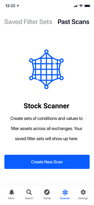
Landing Page
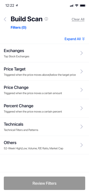
Build Parameters
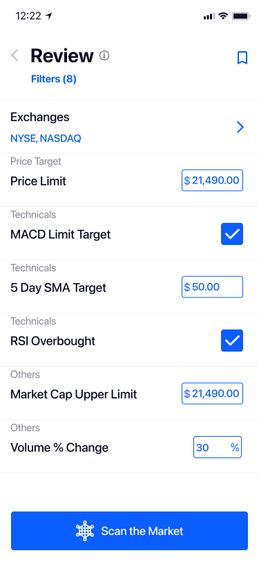
Review Parameters
CASE STUDY OVERVIEW
About the Client
Stock Alarm (https://stockalarm.io/) is a financial services company that allows day/swing traders from all backgrounds to set conditional alarms to be triggered from live stock price movement.
How does Stock Alarm stand out with respect to their competitors?
1 Having a minimalist yet powerful design.
2 Educating the users from all backgrounds by providing them with information/resources to help gain knowledge and understand the ‘why’, rather than just influencing them with ‘what’ stocks to invest in.
Who are the Users? What are their Needs?
Users range from young novice traders to retired professional traders who are looking for less expensive alternatives to the current stock market tools.
Stock Alarm enables browsing for individual assets to set alerts. Users find it challenging and time-consuming to identify relevant stocks from the sea of stocks available in the market and only a small number of stocks have the potential to find profit at any one point. In order to trade effectively, users have requested an easily accessible tool that allows them to track and generate alerts for multiple assets at once based on a user-defined threshold.
Goal
How can we assist users from all backgrounds scan the market to uncover hidden investment opportunities and be efficient investors?
Solution : Stock Scanner
The Stock Scanner feature allows users to search the market to get a list of assets that meet their criteria on demand.
How this works : Users define a set of parameters according to their trading strategy. Based on these user-defined filter criteria, the new Stock Scanner feature scans the current market and offers a list of potential assets for trading, saving users' time on asset discovery. The filter criteria could be based on organizational, technical, fundamental or economic information.
This design is the minimal product of the Robust Scanner; additional functionalities will be added down the line. In order to help users have a seamless interaction, this new feature design will remain faithful to Stock Alarm’s branding.
UNDERSTANDING THE SCOPE
1 Gained insight into the overall problem the Client is looking to solve: how it differs from its competitors, user demographics, and success KPIs.
2 Requirements and Constraints
Mobile users >90% : This new feature design targets Stock Alarm's mobile app.
6 Week Timeline : Based on our initial understanding of the scope and requirements of the Stock Scanner feature from the client, we were able to provide an agenda for our weekly cadence, as well as the expected deliverables and milestones that Stock Alarm might expect based on our 6 week deadline.
Aims at Simple and accessible User Experience unlike its competitors with complex and overwhelming UI.
Identifying Key Steps
Based on our discussions with Stock Alarm, we were able to put together the user flow of the Stock Scanner feature to identify the steps that users would take to retrieve a list of assets based on customized parameters.
User Flow Diagram - Depicting user interaction while retrieving relevant assets : User navigates to the Scanner feature from the Home Page, goes through the Introduction(NUX) flow, selects filters, reviews and views results.
SETTING THE STAGE FOR DESIGN
Once we were able to prioritize the functionalities, each one of us came up with our own paper sketches for the entire flow of the Scanner feature that allowed us to visualize as many solutions as possible without being influenced by each other’s thoughts. With a variety of approaches, we refined our sketches, combined some and discarded a few others. This allowed us to digitize our sketches by bringing the best ideas amongst our solutions.
Crazy 8’s sketches - For displaying filter parameters
Wireframe of the Scanner flow
(Image by Joy DeHaven, UX Designer, Team Member)
Takeaway : Constraints
Understanding the technical feasibility prior helped us to adapt and design according to the possibilities and constraints.
For eg., We thought it would be great if we could help users ‘fail gracefully’ by letting them know the number of results available as they select the parameters to build the scan instead of having them wait until the scanning results are complete. Since this is technically challenging, it may not be ideal for the MVP. Learning the technical feasibility from a development perspective based on resources, timeline and mobile performance enabled us to build our design accordingly.
GETTING CLOSER TO FINAL PRODUCT
Stock Alarm provided us with the style guide and UI assets. We translated our wireframes into High Fidelity prototypes that matched Stock Alarm’s branding.
I took the responsibility in designing the introduction flow, the review page and the results page. Though each one of us owned portions of the user flow, in the end it was the coordination and teamwork that helped us shape our final design.
Upon delivering the prototype to Stock Alarm, we received feedback and iterated on the design further to meet their needs.
NUX Flow (Owner : Shiva Malavika Ganesh)
‘Users want to learn about this new feature in detail so it helps them understand what it does and how this opportunity benefits them’
Based on our conversation with Stock Alarm, I put myself in the shoes of a novice user and began writing the script for the Introduction(NUX) flow in layman's terms. I was able to figure out the structure of the design by first figuring out the content. My teammates stepped in to check and tweak the content once I was able to build the introductory flow.
Build (Owner : Joy DeHaven)
‘Users want to create custom conditions so they can narrow down their search to view assets that fit these conditions’
Users can select desired parameters (filters) and/or enter values on this page. In contrast to Stock Alarms' prior design, which required users to navigate to multiple pages in order to view the sub levels, one of my teammates worked on adding accordions to nested filter sets that allows the user to see all of the filters on one page.
Review (Owner : Shiva Malavika Ganesh)
‘Users want to review their filter conditions so it enables them to add, edit or delete before scanning the market for a list of relevant assets’
View Results (Owner : Shiva Malavika Ganesh)
‘Users want to view all the assets based on their chosen criteria so they can track and uncover new investment opportunities’
We brainstormed and came up with two potential results page solutions: my version had a simple User Interface and was consistent with the rest of Stock Alarm's pages. It has two columns: the ticker and the filter value, the latter of which can be sorted or swapped with another filter parameter value. Another version, created by one of my teammates, Jason Sutherland, has a tabular structure with horizontal scrolling of all relevant values, with the intention of making comparisons easier.
Because Stock Alarm aims for a simple and clean user interface, my two-column version that met their requirements was proceeded.
Stock Scanner Landing Page (Owner : Joy DeHaven)
We were able to find the time to go beyond the MVP and create another design for the Scanner landing page from the initial version after learning about Stock Alarm's future goals for how they want their users to experience their landing page.
(a) Landing Page - Before
(b) Landing Page - After
UNCOVERING REAL USER INSIGHTS
We conducted five usability testing sessions through Zoom video calls, with each of us UX designers moderating one session at a time.
Stock Alarm was able to connect us with the target test participants, who not only expressed their likes and many concerns while using the product, but also came up with unique feature requests, that has a potential for greater user engagement.
“In terms of the content, I am able to get a very strong understanding of what it does and what I would accomplish before beginning to build a scanner”
–Participant quote (during User Testing session)
Image from a User Testing session with a participant
Outcome
The results of our usability studies revealed usability issues from the perspectives of both novice and seasoned users.
KEY TAKEAWAY #1 : All users had difficulty locating this new feature, indicating that there is a need for a greater user education.
KEY TAKEAWAY #2 : The testing sessions revealed that our design needed to be modified to better suit the needs of new users.
“The layout is very clear, I build the conditions and I review them. However, the sheer amount of filters seems to be overwhelming, and I'm getting lost in the accordion menu's nested levels. It feels better with contextualized sections.”
–Participant quote (during User Testing session)
KEY TAKEAWAY #3 : Users proposed new features and actionable solutions that they believed would be incredibly useful.
During the call, we valued all of the participant requests, culled them all, and sent them to Stock Alarm to help them consider adding them to the roadmap in the future.
“I am looking for an advanced feature that provides me with a fewer set of personalized assets so I don’t get overwhelmed by the amount of information that I have been presented with in one go.”
–Participant quote (during User Testing session)
During our last week with Stock Alarm, we presented all recordings recorded during the sessions and generated a test report consisting of a prioritized compilation of insights and the approaches we came up with that might help fix the problem.
CONCLUSION
Our 6 week internship has come to an end! Designing this new feature in a real world scenario has been an enjoyable and a great learning experience.
We initially designed the user interface of the minimal viable Stock Scanner feature, then solicited feedback from target participants during usability testing sessions by actively listening, observing, recording, and empathizing with them.
Deliverables
We provided the High Fidelity Prototype of the minimal viable Stock Scanner feature, a test report with a prioritized list of findings and actionable solutions, and recordings from the usability testing sessions as our final deliverables.
Learnings
1 Empathizing with my team members
Getting to know and empathizing with the designers on my team strengthened our teamwork. This collaboration greatly helped me in perceiving ideas from our varied thought processes.
2 Establishing a connection with the company
Welcoming any adjustments, disapprovals, and requests from Stock Alarm while keeping the timeframe in mind was crucial to achieving our design goal.
Based on the initial requirements gathered from Stock Alarm, we were able to scope out our deliverables based on the 6 week timeline. As we worked on each deliverable, we received critical feedback and a deeper understanding of their technical constraints which helped us focus and iterate on our designs to get closer to their design goals. When new components were introduced, we added them to our backlog and were able to design them based on their importance and our ability to complete them within the time constraints.
3 Understanding the "why"
Understanding a component's requirements, why we need it, and what value it offers to the user or the business, among other things, helped us in making better design choices.
It was critical for us to understand not only user needs and business goals, but also the development perspective when making design decisions, as some features may be feasible to implement while others may not be at that moment.
4 Insights and challenges during Test sessions
We were able to obtain important insights from novice users during our user testing sessions, which helped us understand how our design should operate to accommodate the needs of the new users.
The scheduled sessions presented some difficulties.
We had six people sign up for the test. One of the participants did not show up, and the call with the other had to be cut short due to environmental concerns.
Another challenge arose when one of the participants did not appear to be technically savvy and was unable to use the Zoom video conference. We learnt the importance of time/schedule flexibility when running sessions to assist users with other technical issues or if they arrive late for the call.
Next Steps
If we had continued working with Stock Alarm, our next steps could be as follows:
1 Connect with additional participants to conduct usability sessions.
2 Iterate on the designs based on the feedback from the users.
3 Conduct a second round of usability testing with the updated prototype and revise it based on the insights gathered.
4 Hand off to the Front End Developer(s) for implementation.
5 Work on expanding the scope beyond the minimum feasible functionality and tackling additional challenges to implement the feature.

